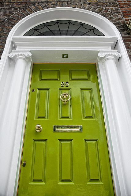
Imagine walking into a room where every shade dances between the vibrancy of yellow and the cool calm of green. Often caught between definitions, this color is Chartreuse—a hue named after the famous French liqueur produced by Carthusian monks. It’s a color that’s neither fully yellow nor green but bold, unexpected, and full of energy. As one decorator described, “Chartreuse color of the unexpected, the embodiment of both serenity and boldness.” But how did this color, once relegated to the background, come to define modern design trends? Let’s journey into Chartreuse’s surprising impact on our visual world.
The Historical Journey of Chartreuse
Chartreuse’s origins trace back to 1764 when French Carthusian monks began producing a green liqueur known as Chartreuse. This drink inspired the color name, and by the 19th century, the term “chartreuse” began to describe the unique yellow-green shade. Interestingly, Chartreuse as a color became widely recognized in the 20th century, particularly in fashion and interior design, where it was celebrated for its ability to add zest and energy to any palette.
The Psychological Impact of Chartreuse
Chartreuse sits at an intersection of yellow’s joy and green’s tranquility, creating a stimulating yet balanced effect. This duality intrigues it in various contexts, from interior design to branding. A study from the Journal of Environmental Psychology noted that colors like Chartreuse can evoke feelings of optimism and energy while promoting creativity and clarity of thought. Chartreuse is often used in branding to capture attention and convey innovation and modernity. For instance, in the tech industry, where standing out is crucial, Chartreuse is a popular choice for logos and branding materials.
The Popularity of Chartreuse in Design
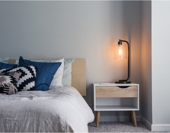
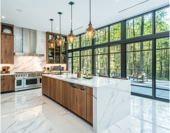
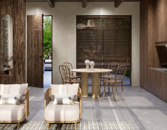
Chartreuse has grown in popularity over recent years, particularly in interior design. According to a 2022 report by Pantone, there was a 35% increase in the use of yellow-green hues in home decor, reflecting a broader trend toward vibrant and energizing colors. Interior designers often use Chartreuse as an accent color to add a pop of brightness to neutral palettes or to create a striking contrast with deeper hues like navy or charcoal.
In fashion, Chartreuse is making bold statements on runways. A report from the Fashion Institute of Technology (FIT) in 2023 highlighted a 40% increase in chartreuse items featured in high-end fashion collections compared to the previous year. Designers are drawn to its versatility and ability to work well across different seasons, from spring freshness to fall warmth.
Chartreuse in Pop Culture and Media
The cultural significance of Chartreuse extends beyond design. In pop culture, it has often been associated with avant-garde movements and creative rebellion. The color was notably used in the 1960s by the Mod subculture, which embraced bold and vibrant colors as a form of self-expression. More recently, Chartreuse has been featured prominently in movies and television shows aiming to evoke surrealism or whimsy. For instance, Chartreuse frequently appears as a background color in Wes Anderson’s films, adding to the quirky and nostalgic atmosphere.
Environmental and Digital Applications
Chartreuse is a popular choice for physical design and digital environments. The rise of digital media and graphic design has led to Chartreuse being a favored color in UI/UX design, where its brightness ensures visibility and user engagement. A 2023 survey of graphic designers revealed that 28% had used Chartreuse in their projects, citing its ability to capture attention without overwhelming the viewer. Chartreuse is often employed in wayfinding systems and signage in environmental design because of its high visibility, even in low-light conditions.
Statistics That Speak to Chartreuse’s Growing Influence
The statistics surrounding the use of Chartreuse are as bold as the color itself. A study by Color Marketing Group found that 62% of interior designers believe Chartreuse will be a dominant color in the next decade, particularly in eco-friendly and sustainable designs. Additionally, a survey by the American Institute of Graphic Arts (AIGA) reported a 47% increase in the use of Chartreuse in branding and marketing over the past five years, especially in industries aiming to position themselves as cutting-edge and innovative.
Conclusion: The Future of Chartreuse
Chartreuse is more than just a color; it’s a statement. Its unique position between yellow and green gives it a versatility that few other colors can match. Whether in fashion, interior design, branding, or digital media, Chartreuse continues to challenge conventions and push boundaries. As we move forward into a world increasingly defined by bold and unexpected choices, Chartreuse is set to be at the forefront of design and culture. Whether you love it or find it perplexing, one thing is certain: Chartreuse is here to stay.


